naming, art direction, visual identity
ORIONAS
Real estate property in Vilnius
Case Study:
ORIONAS – Modern homes under a constellation
Project Overview
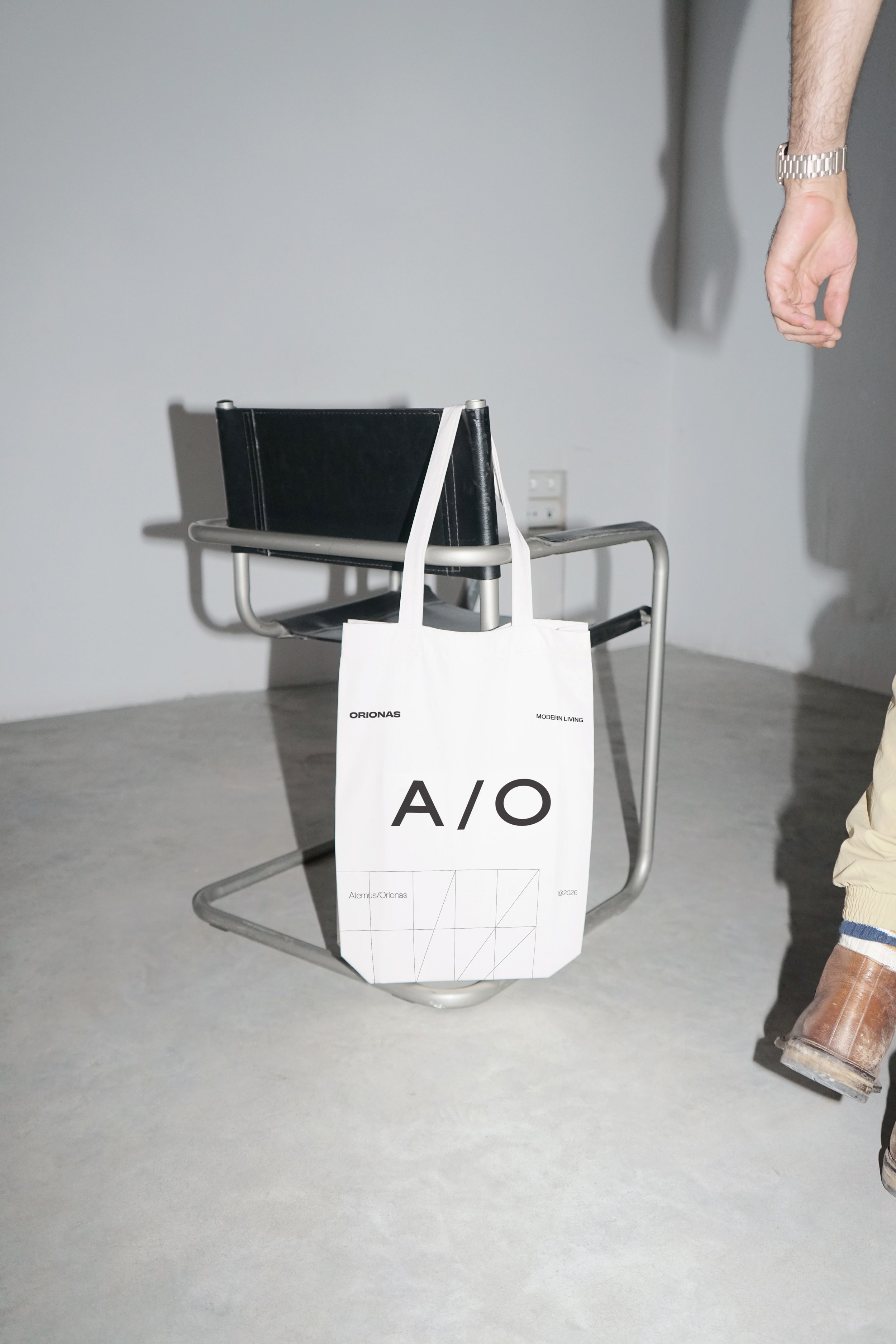
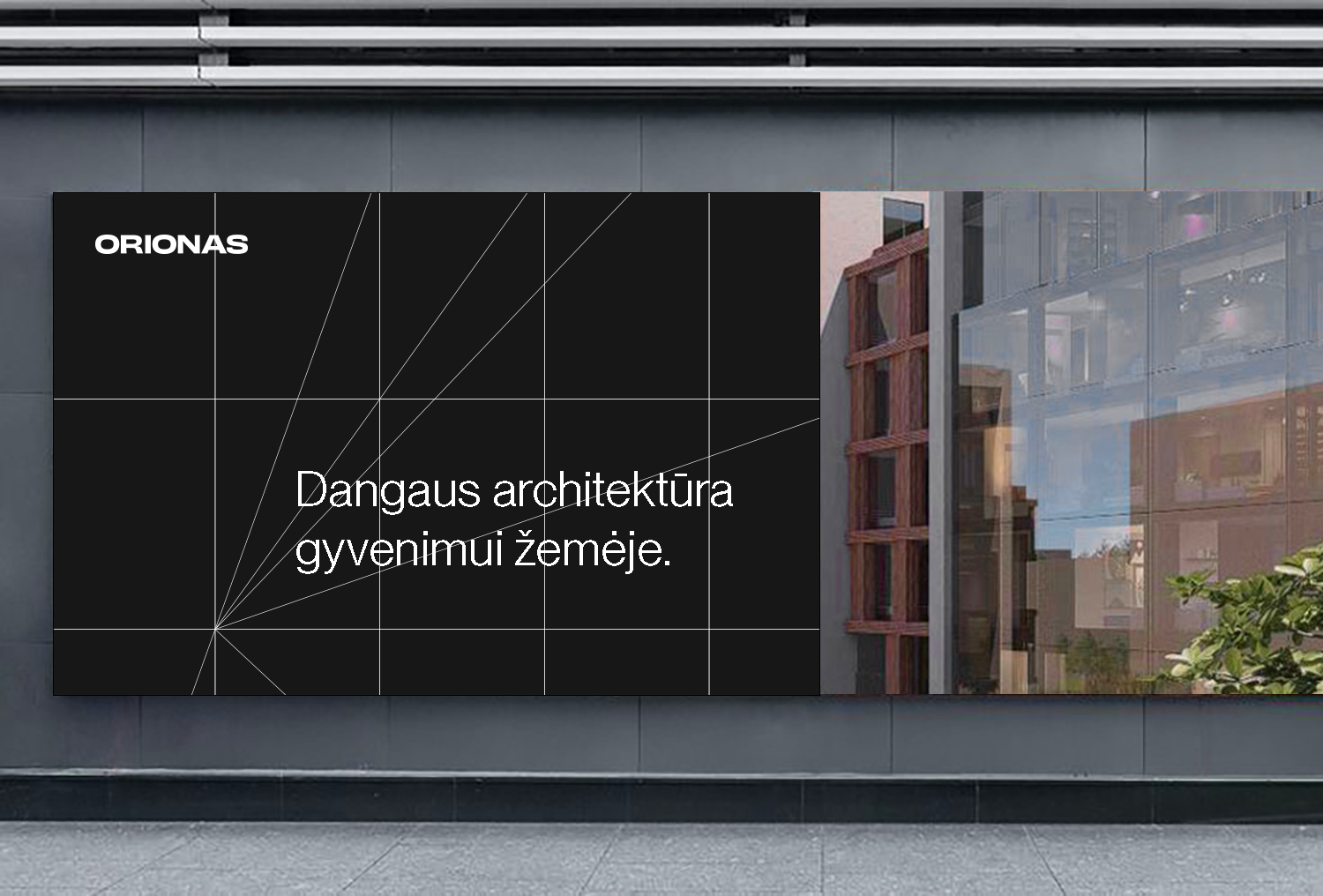
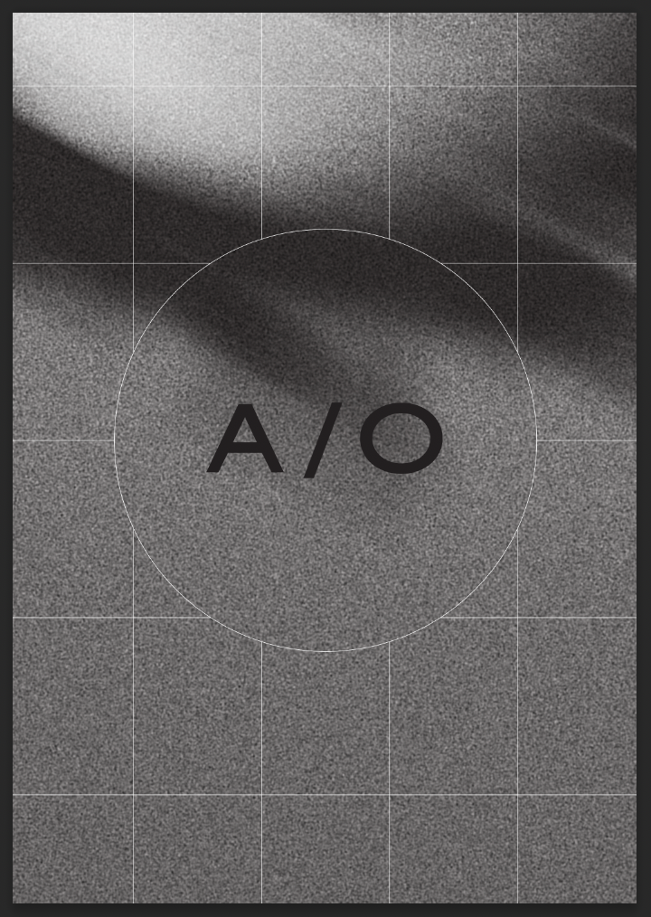
Orionas is a new residential quarter in Pilaitė, Vilnius, developed by Aternus with architecture by Arches. Aternus has spent a decade building projects that combine lasting value, considered design, and quality of life, and Orionas carries that forward: an innovative neighbourhood where modern architecture, nature, and community meet. The name comes from Orion, one of the brightest and most widely recognised constellations, which made it a natural symbol for a development built on clear structure, direction, and longevity. Our task was to turn that idea, Aternus + Orionas (longevity, direction, aesthetics, and function), into a brand identity, "A/O," that could carry the project from the architecture through to how residents experience daily life. The audience is young families, roughly 28 to 42, who think long-term and choose quality, design, and sustainability over quick wins, so the brand needed to feel urban, clean, and understatedly premium.
Solution: Typographic, Logo & visual identity
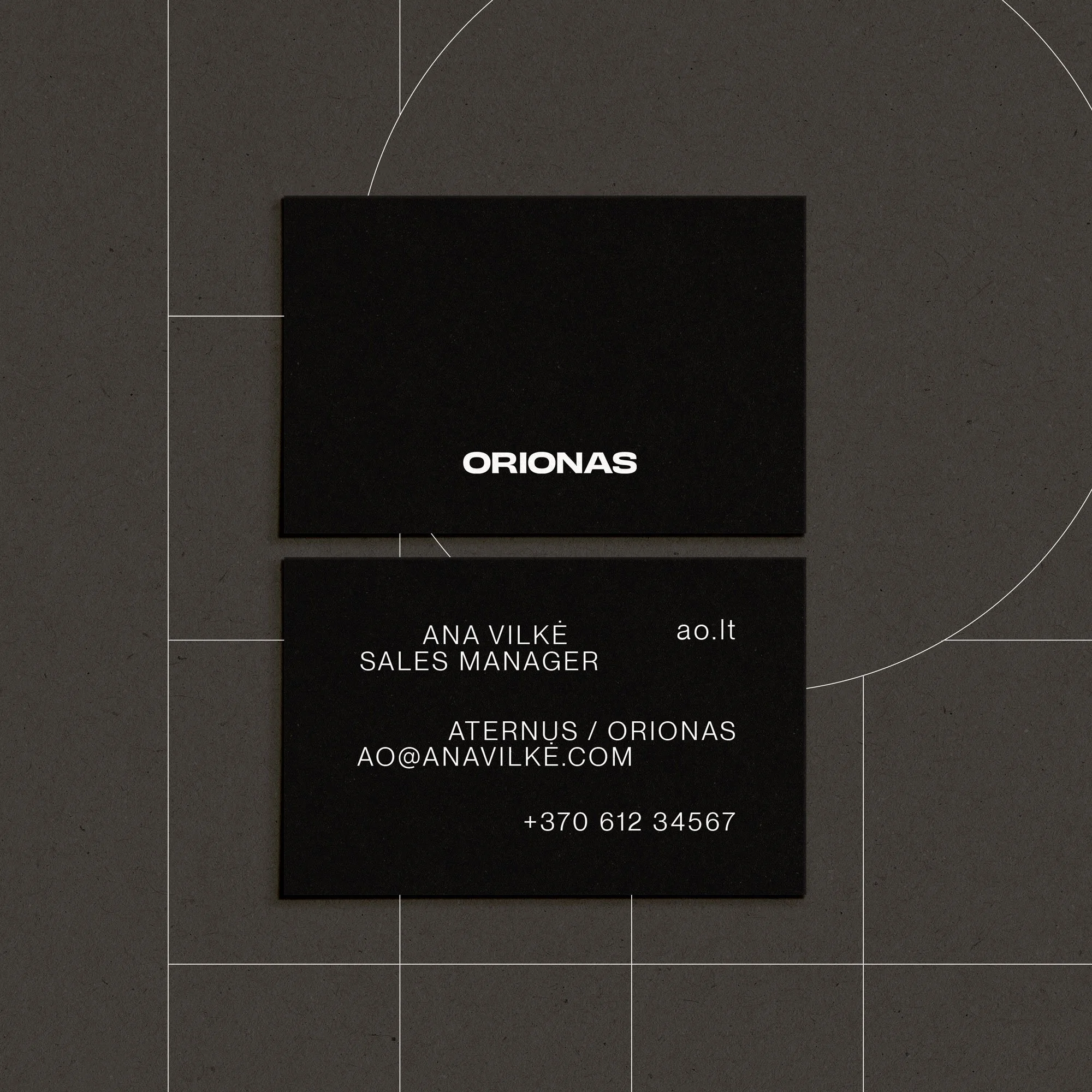
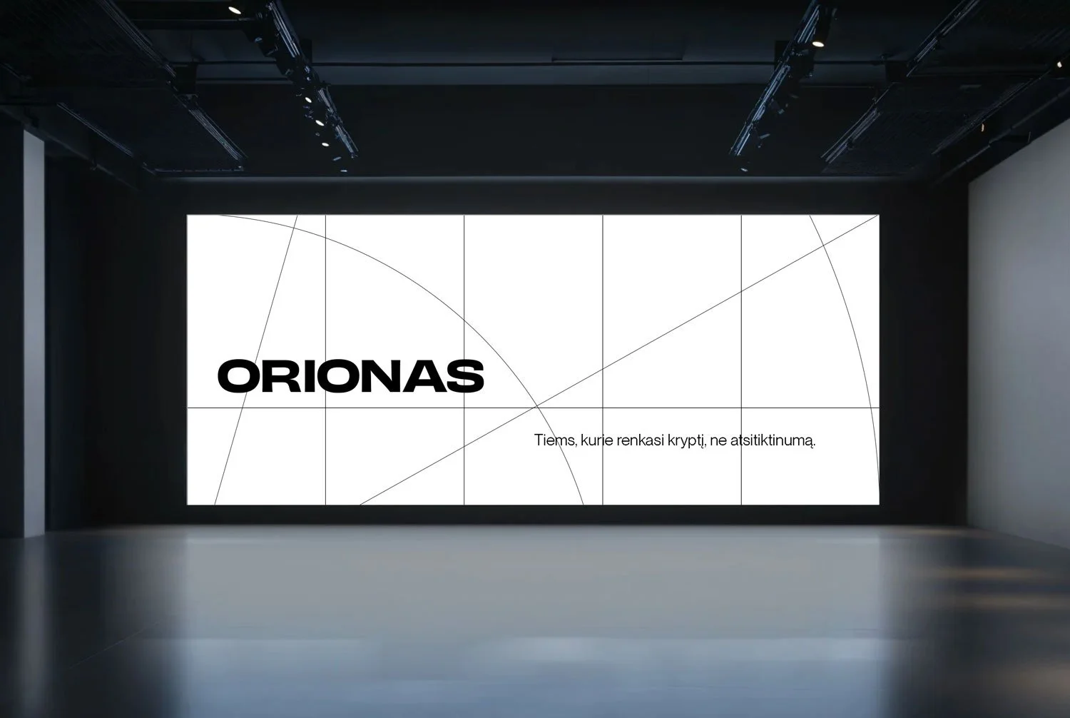
We built a wordmark that stands firmly on the ground and reads as confident. Its wide letterforms suggest a horizon line, echoing Orion's sense of open sky, direction, and connected space. The construction carries a hint of architectural order, which suits a project that wants beauty and function to sit together. For typography we chose Neue Montreal in book and bold: minimalist, with clean forms and proportions that mirror the building's architectural logic and keep the whole system feeling like one piece, from logo to layout.
Visual Identity & Art Direction
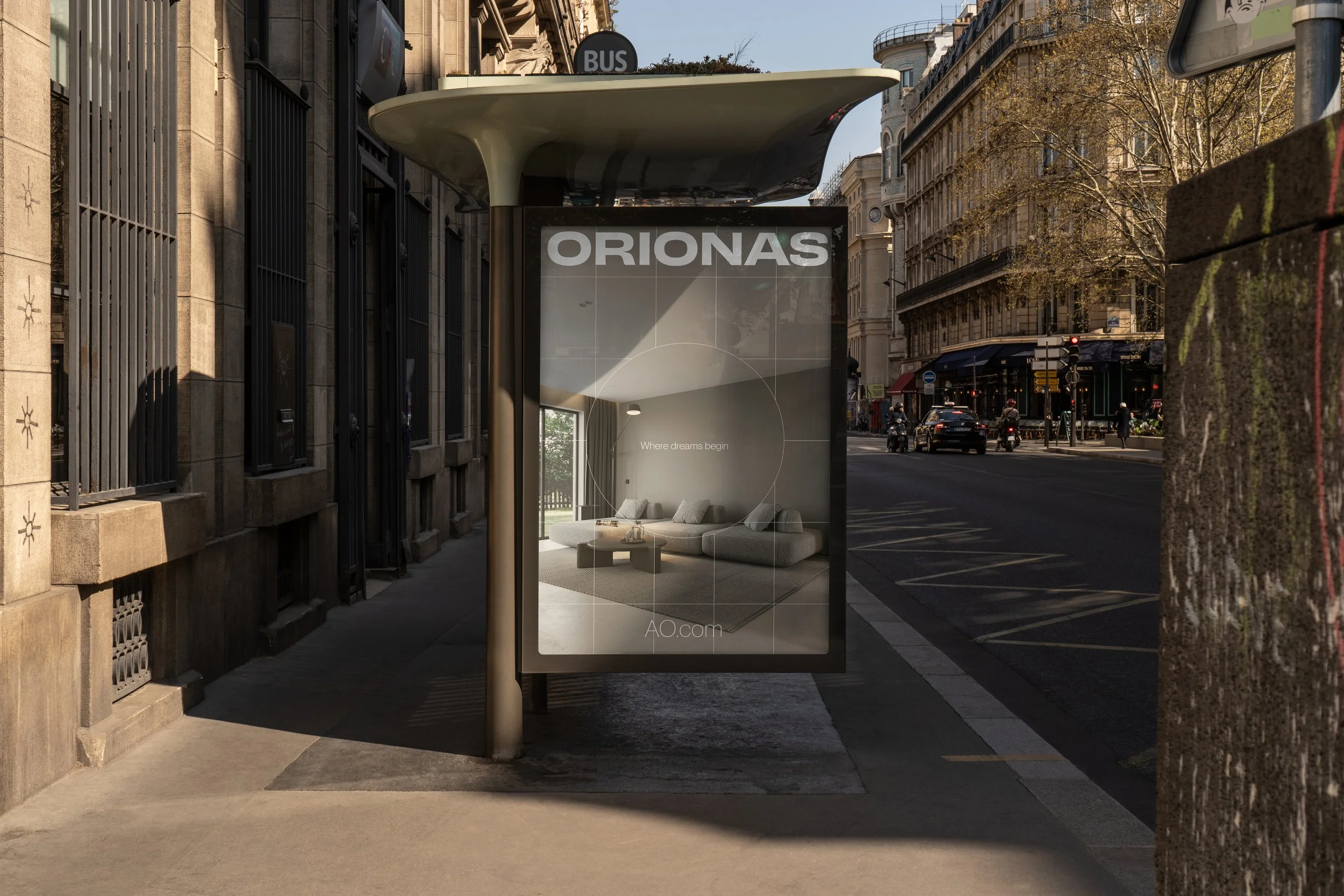
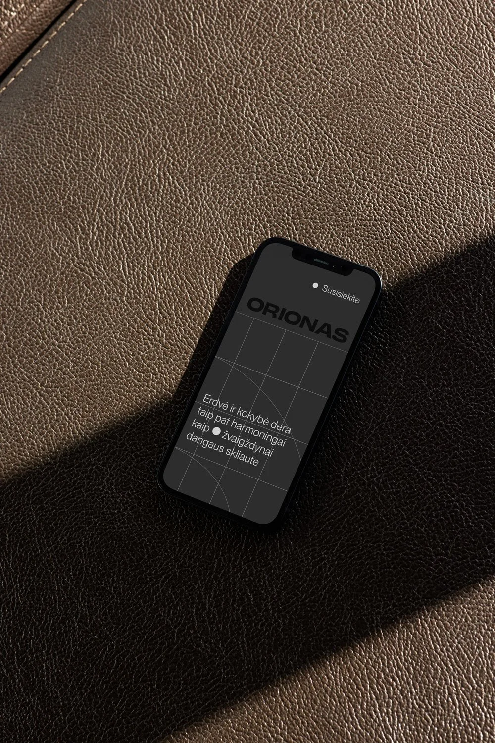
From there we built a system of graphic elements, points, directional lines, circles, and a grid based on the building's six-storey form, that brings architectural structure and astronomical symbolism into one language. Used as fragments or full compositions, they carry across headlines, information blocks, and standalone accents, giving Orionas a recognisable look throughout. The taglines hold the same thought, such as "For those who choose direction, not chance."
Impact
The A/O identity became the visual direction for the project's launch and communication. Brand work is hard to measure directly, but we're proud of the visual signals we set here: a consistent, considered presence that runs from the architecture all the way through to every touchpoint.